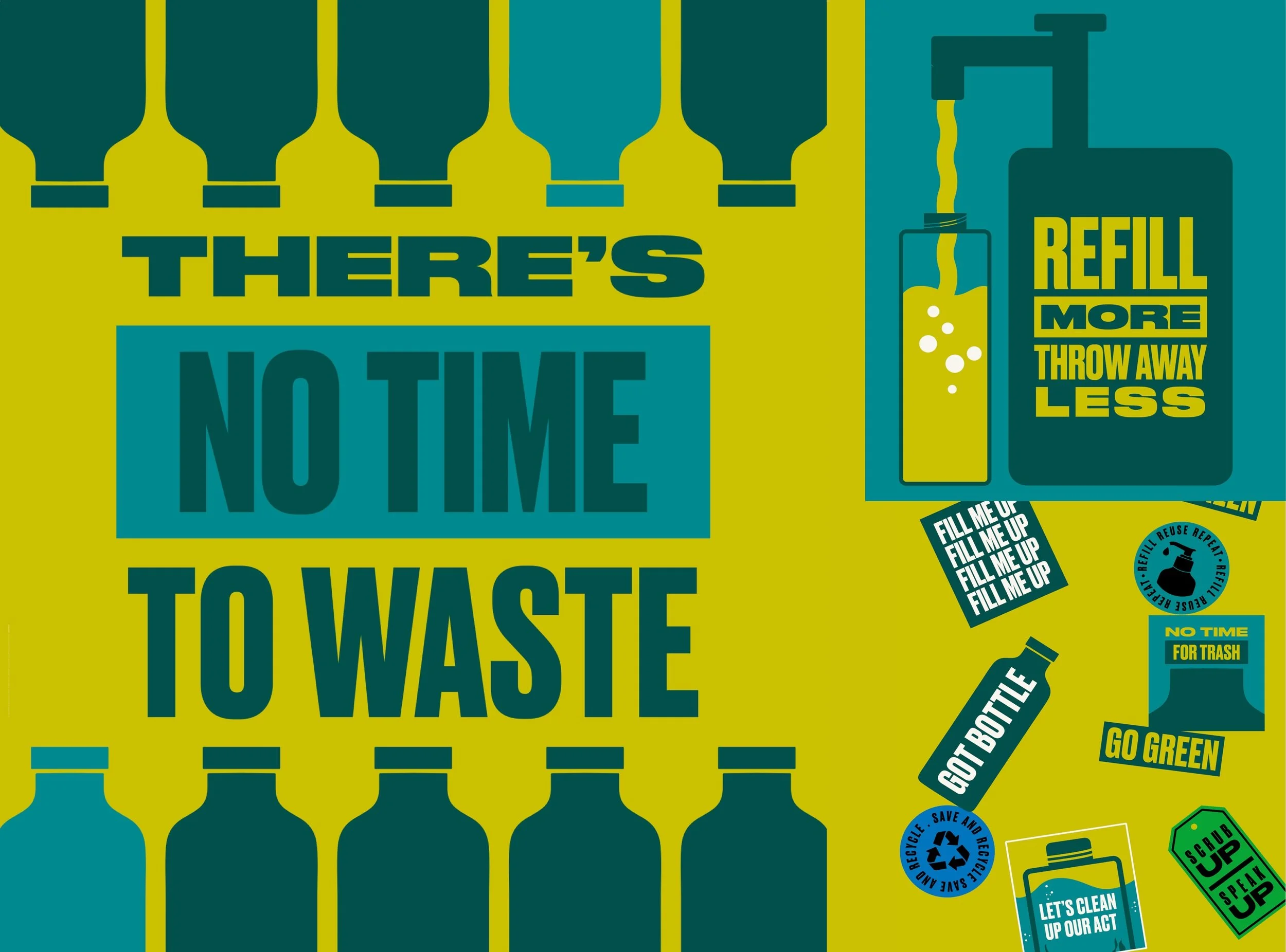
CREATIVE DIRECTION FOR THE BODY SHOP VISUAL AND VERBAL IDENTITY SYSTEM
I led the creation of The Body Shop’s rejuvenated brand identity (working in collaboration with forpeople) and it’s deployment across all brand touch points.
The Body Shop brand rejuvenation was as much about creating a future proof identity as staying true to the brand’s ethical and activist heritage. This has becoming increasingly important in the post-pandemic world where more people than ever are looking for brands with real purpose.
Creative Direction - Teri Henman
Logo Design - Josh Evans
Refills and Pride Campaign Design - Dionne Hélène
NB: The heritage images shown were are for reference inspiration only, all credit is given to the original creators.


The Body Shop Pod is ownable and iconic. A rounded and inclusive symbol, it subtly alludes to the shape of sycamore seeds. Created in 1976, over the years it has grown into a confident stamp for the brand.
I lead the 2019 redesign of the Pod breathing back some of the original heritage charm into the icon.
